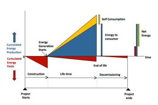
What an odd graphic. Cumulated energy and then it suddenly vanishes multiple times. Then some extra bars to the right, twice, with presumably inverted energy cost in red…? That does not at all match the hight of the previous energy cost, but that of the production does?
It’s not as complicated as you think. It’s showing the various amounts that are part of the calculation and how (in one model) they evolve over time. Each time there’s a vertical line, its height represents one of the things that get added up at the end.
It looks to me as if they made the final red bar on the right too small, but the diagram is there to show how the calculation is done, not to represent actual data.
It would be better to just have the whole lot of 5 numbers (or percentages) instead of bloating them into a diagram with so many lines/areas. If you really need, make a bar graph. Which they also did because they noticed how bad it is.


