Trends looks at searches for a keyword (or topic) compared to all searches performed (in that area) and then the data is normalized.
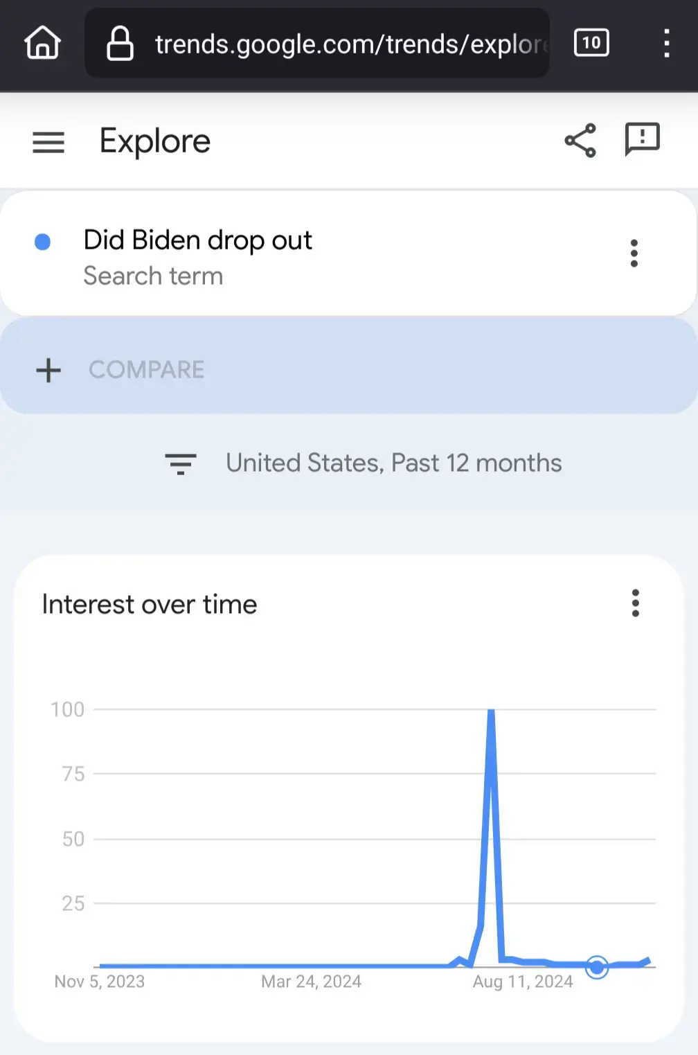
In short, Trends looks at “is it hot or not” (e.g., popularity of a term, NOT actual search volumes) and 100 is peak hot while 0 is peak cold. So that curve up today means it is starting to get hot when you compare to the rest of the data except that spike which is around when he dropped out. Narrow your view gap from 12 months to past 1 month and you’ll see a much different story.
Source: am former SEO and this shit was part of my daily job.
I understand the graph isn’t labeled but I’m pretty sure that’s a percentage. I.e. 10% of the peak when he actually dropped out was searching it today.
Overstated
That’s not how Trends works.
Trends looks at searches for a keyword (or topic) compared to all searches performed (in that area) and then the data is normalized.
In short, Trends looks at “is it hot or not” (e.g., popularity of a term, NOT actual search volumes) and 100 is peak hot while 0 is peak cold. So that curve up today means it is starting to get hot when you compare to the rest of the data except that spike which is around when he dropped out. Narrow your view gap from 12 months to past 1 month and you’ll see a much different story.
Source: am former SEO and this shit was part of my daily job.
Right it’s not nearly as popular now as when the story broke (by a lot), but it’s more popular now than it was a month ago. Meh.
For sure. In any case, people are really stupid. 😢
TEN WHOLE PEOPLE are curious about Biden on election day???
I understand the graph isn’t labeled but I’m pretty sure that’s a percentage. I.e. 10% of the peak when he actually dropped out was searching it today.