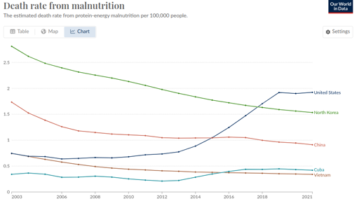
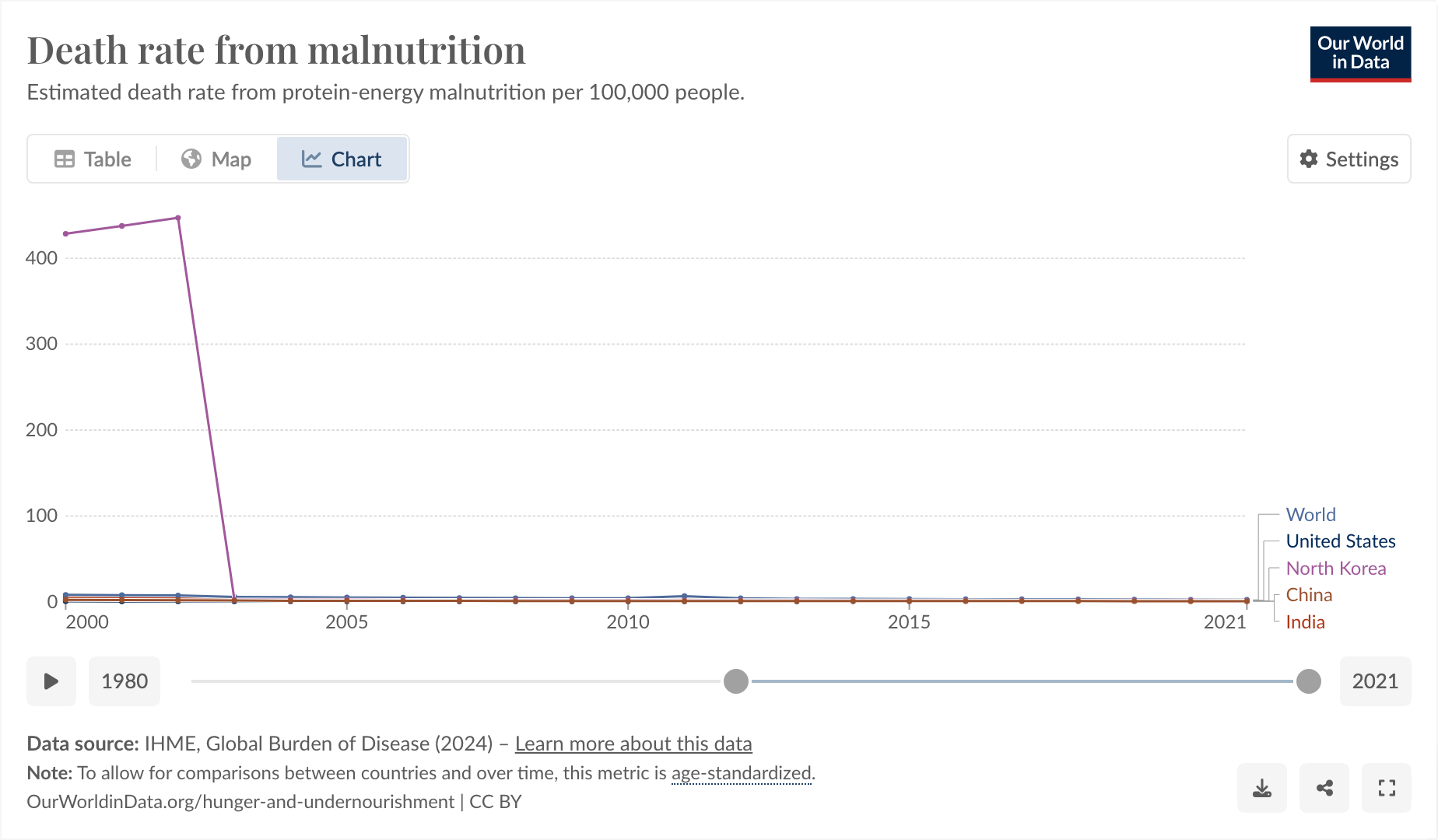
This is a weird one. Bear with me. From [email protected]:

So I said to myself, “that’s a little bit weird. The US one going up, I can actually believe, but the North Korea one being lower is definitely wrong.”
I think Our World In Data is just being shoddy, as they often do.
https://www.wfp.org/countries/democratic-peoples-republic-korea
The thing I found funny, and why I’m posting here, comes from observing why it was that they started their graph at 2003 and exactly at 2003.

I feel like you could use this as a slide in a little seminar in “how to curate your data until it matches your conclusion, instead of the other way around.”
And also, I don’t think the hunger rate suddenly dropped from epic to 0 exactly in 2003, I think more likely Our World in Data is just a little bit shoddy about their data.


I didn’t say kim exaggerated western aid, why do you say that?
The NK regime just lies to look strong and not feeble, a classic from dictators.
What we know about NK is that they are struggling with food today.
No way to be sure. We can be sure that US propaganda will always say DPRK is terrible, and China is about to collapse, and we know it just lies to look strong and not feeble. a classic.