

Skoda have done something similar with their latest offering. No Skoda badge, no radiator grill. Just SKODA in a boring font.
Jaguaren’t
People are up in arms, apparently, because Jaguar have gone woke. These same people have too much time on their hands if they’re irked about a brand change.
You’d probably get fewer of the lazy tldr downvotes if you put quotation marks around “gone woke” to distance yourself from it.
Making their logo ugly is going woke?
Woke just means bad now to the less mentally inclined it seems.
Check out their new ad. They’ve gone all electric and have ad full of androgynous / gender ambiguous folks, and say they’re aiming for a brand new market. The gammons are having a hissy fit.
It’s a shitty logo update, as is the case most of the time these days, but yeah it’s not worth getting worked up about lmao
Top looks like it belongs on a nice sports car.
Bottom looks like you can find it on a new Multipla.
That font is awful. The G looks completely unrelated to any of the other letters.
The G looks completely unrelated to any of the other letters.
I see this, since half of the letters appear to be uppercase, and the other half lowercase:
JaGUar
Yeah, I see that, too, but at least everything else is all smooth curves. The hard angle on the g makes it stick out as super different.
JaGUar
No, the Multipla deserves better.
Bottom text looks like it belongs on some short-lived product for flavoring water or a gas station energy drink.
I too am something of a joguar
I dont understand modern logos principles. How tf is that recognizable. Also animals are fun. Stop getting rid of animals from icons.
Somewhere in Jaguar HQ, a marketing firm convinced the CxO suite that the most pressing problem facing the company was that the logo was wrong. So, in the interests of the shareholders they write off the goodwill value of the existing brand and dump millions of euro into this.
But who cares?
Sure, the idiots at jaguar are flushing their brand, but who cares?!? It’s their shit pile to destroy, after all…
It is more that there’s a grift happening. What’s the odds that theres a tenuous conflict of interest here with the various business and executives concerned? It’s a small cub and everyone scratches each other backs.

Hah don’t worry, the existing brand is utterly fucked now. One of the worst, most unreliable and badly made cars on the market
It’s still a prestige brand in the eyes of the masses. It might not be as good a brag down at the country club, but letting the plebs know that you can afford a car that costs more than their house still has value.
It might not be as good a brag down at the country club
That depends on if you’re buying new or you have a classic roadster.
One of the worst, most unreliable and badly made cars on the market
But enough about Tesla.
Everyone circlejerks about this online but every IRL owner I’ve actually spoken to say it’s the best car they’ve ever owned.
So, I’ve never owned one, but did a test ride on a con. It was the most plasticy, janky mess I ever sat in. Ok, a Hummer I once sat in was maybe equally bad.
Every surface your hand could touch wasn’t fastened properly and moved in ways it shouldn’t. The door handles wiggled about. The touch screen replacing the middle console - absolute nightmare. The swinging door got stuck halfway.
You could say, all of this is the interior and not the engine. But it’s what the user interacts with. If I can’t trust the manufacturer from my experience with the door handle, I’ll have a hard time trusting them about the brakes.
Blimey, maybe their production quality varies based on which factory it was built in (or Euro NCAP have better quality control regs), the one I’ve been in was lovely!
I don’t know, I’m in Germany
Yeah, because who wouldn’t want to drive a car from a company whose quality control policy is “don’t” that does welding like this?

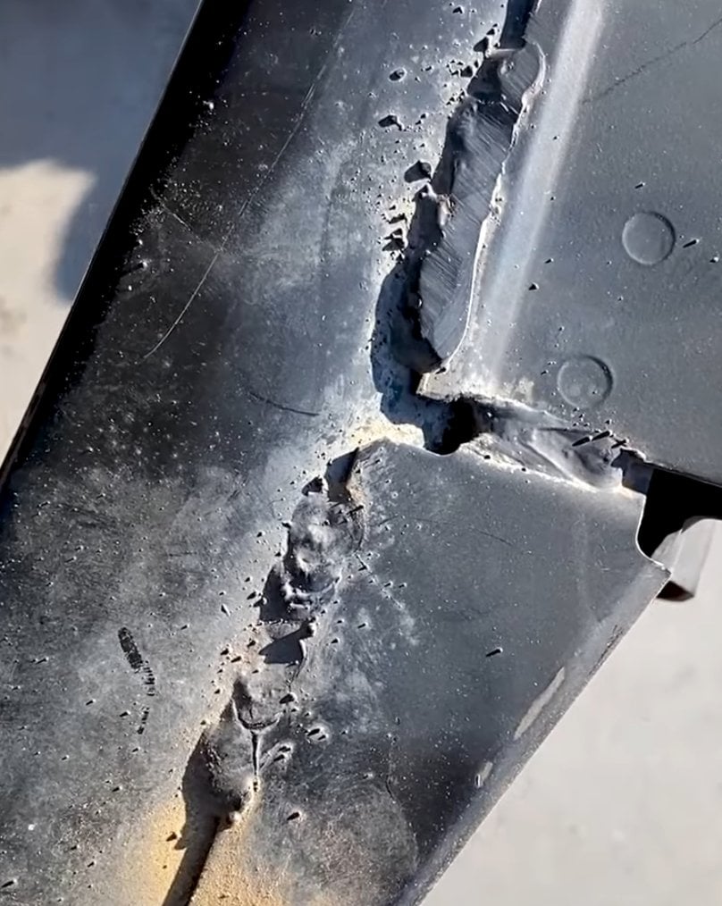

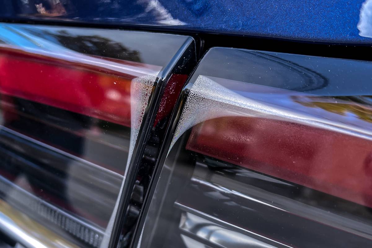
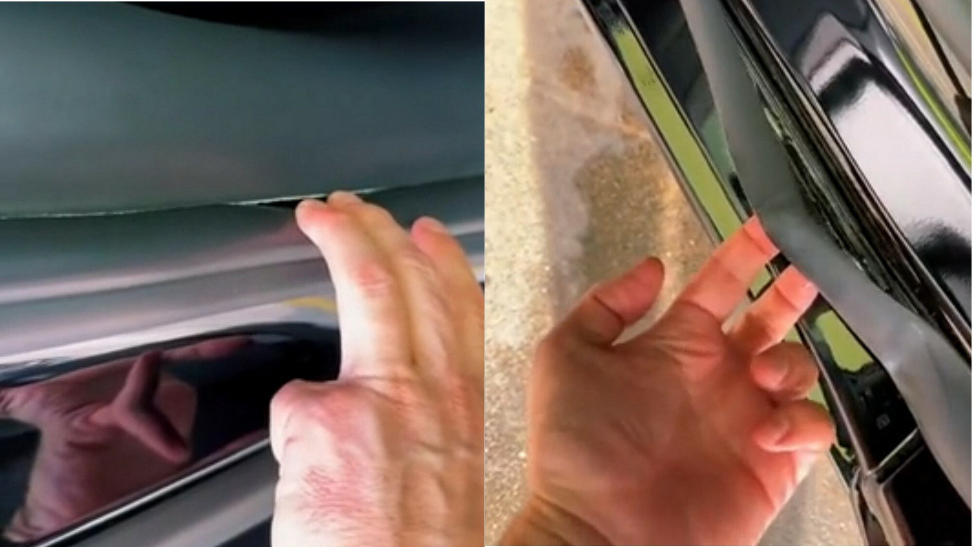
And fit things together this well

It may be quick and pretty to look at if you don’t inspect it closely, but it has the price tag of a brand new Aston Martin and the build quality of an 80s Yugo.
It takes a heroic amount of cocaine to make something so devoid of taste and see it through.

What’s this?
What’s this?
What’s this?
What’s this?
There’s magic in the air!
UwU what’s this?
Notices whiskey tumbler 🥃 OwO, did Don Draper-sama leave this for me? picks it up and sips nervously so smooth loosens tie Notices ad campaign pitch on the table 📄 O-oh my, the client is gonna love this… or will they? 👉👈 nuzzles storyboard Y-you like the tagline? “Happiness is just a purchase away”? rubs temples dramatically Advertising is so hard lights cigarette Client-sama, pwease approve my pitch, I worked so hawd on it 🥺👉👈 smolders in existential dread
Slightly misleading without showing the color, only slightly though
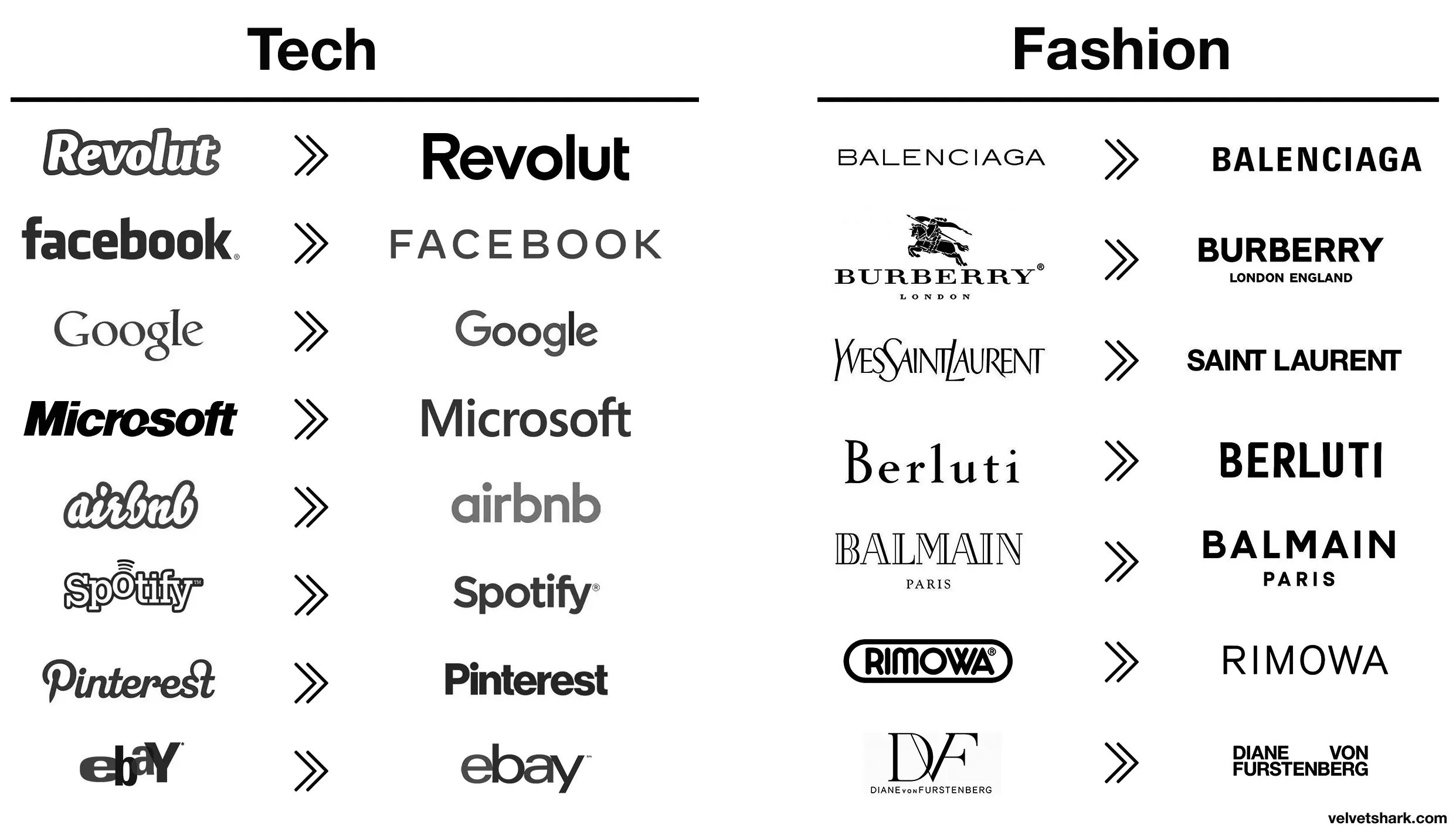
Spotify and EBay made the right choices here, the new logos are way better.
It is subjective, I like the old eBay logo more, but dislike the old Airbnb one.
What’s the reasoning behind? Or just a trend?
I think it’s just a long-running trend across many different companies towards simplification. Here’s the Apple logo for example:
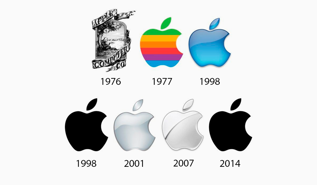
Gotta say, the original Newton logo would’ve looked sick if engraved on the back of a product. Too bad nobody has ever done it.
I don’t see it. In this case, I see basically the same since 1977, or being strict, 1998. Unless they go for just " A P P L E " next. It’s, in my view, a big step to abandon a graphic for letters.
All these minimalist labels save .0005¢ every time they’re printed, probably even more on promo booths, banners, and the like.
I think it has more to do with being readable on small screens, like mobile phones. It still doesn’t make sense to me to completely remove your logo and replace it with a sans serif name of your company like jaguar just did.
All the companies are gonna merge over the next decade or so, leaving a handful of megacorporations to lord over our cyberpunk dystopia. It’s just easier if all their logos already look the same.
Aaaah then indeed that makes sense (and this is not ironic).
Oh, I wasn’t being entirely serious, though there is an element of truth to it. It probably is a measurable cost savings over the scale of the business.
I still think these unremarkable corporate logos are boring AF. Just makes them visually soulless along with just being corporate soulless.
Those old fashion logos are actually sick. Concerning that an industry that sells style would make these their logos.
Except eBay, that was always trash.
Their business is literally selling people’s trash so it’s amusingly appropriate lmao
I wonder how much correlation there is between logo blandification and being owned by giant corporations.
Better:
- Revolut (though a fintech company named after a revolution lacking the charge at the end is still moronic in several ways)
- airbnb (from awful to meh)
- Spotify (same)
Worse:
- Pinterest (original fit the platform and what it is/was pretty much perfectly. Current is meh)
- eBay (both are bad IMO, but at least the original was bad in a playful and eye-catching way. The new one is just more meh
- Burberry (the stag was notable and signalled a history of old-fashioned quality that’s suitably rugged. The new one is meh AND insecure about people knowing which London they’re from)
- Rimova (yet another fashion brand apparently afraid of being noticed
- DF (from one of the best and most fashion-appropriate logos to an absolute eyesore and kerning nightmare that invites vandalism)
- Jaguar (From absolutely iconic and great in every way to even uglier than the new DF one. I hope whomever came up with that got both fired and beaten and I’m a pacifist.)
The rest just go from meh to slightly different meh 🤷
Spot on.
I liked the old aibnb one.
Microsoft went from “boring with a bit of attitude” to just plain boring
DF gets points dedacted for missing the ü dots on both, looks absolutely stupid to a german speaker
I prefer the new font but dislike the removal of the jaguar logo.
They kindly did the needful with the logo.
I love how the new logo could be literally done in less than a minute on fucking microsoft office. They didn’t even bother with a cool looking font, just generic curvy shit
I’m sure they spent an unreasonable amount of time getting that ugly font look just right.
It cost at last 50 million in a fancy name designer fees.
Changing things for sake of changing things. Like Microsoft with every moronic “update”.
JaGUar


![You know what, fuck you [un-Jags uar icon]](https://lemmy.world/pictrs/image/c1e5def3-4f79-4ee4-b74e-3672dac8df0e.png)